Small living room arrangement


See how our products will look in your interior
Check out the free visualizer on our website. Take a picture of the room, choose the slats you are interested in and you’re done!
Go to visualizer
Lamela White L0101
Check this
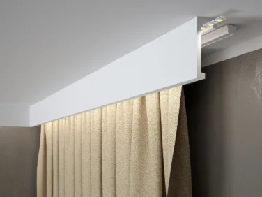
Curtain rail QL026
Check this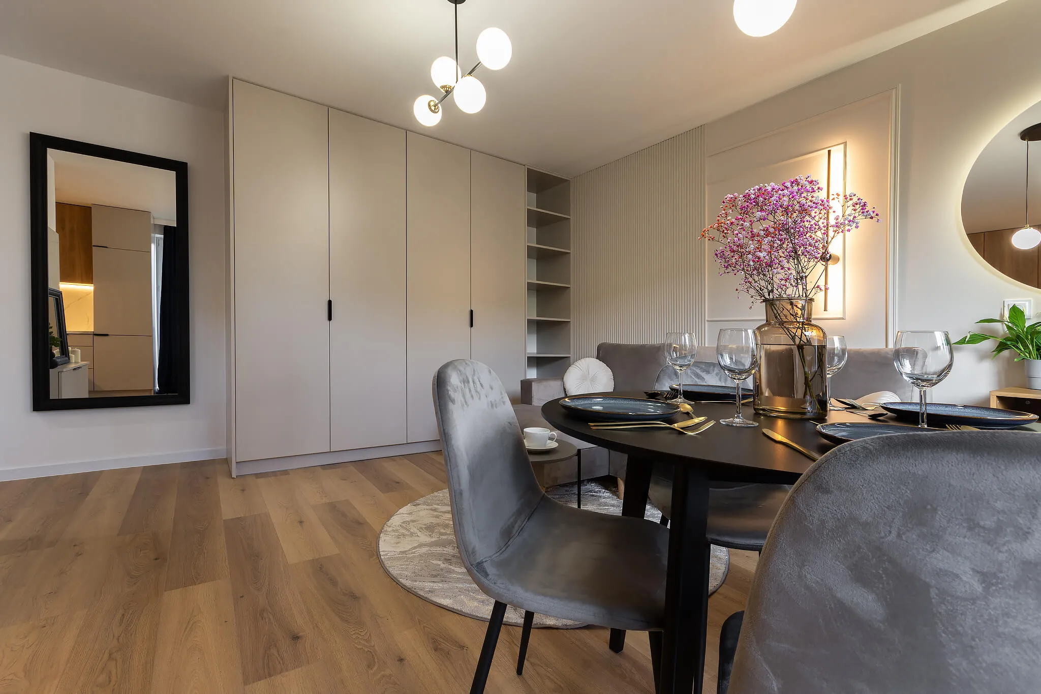
The contemporary developer market definitely does not spoil us in terms of apartment size. We have to deal with increasingly smaller surfaces, trying to maintain a balance between the practicality of the chosen solutions and modern design. This is not an easy task, but the @jeremi.bombala project proves that it is possible to design a small space so that it is beautiful and practical.
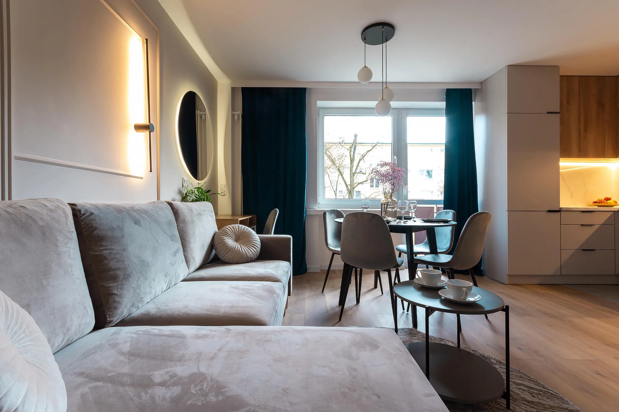
The first element worth paying attention to is color consistency. Jeremi opted for a universal path in creating the interior base – panels imitating wood on the floor and neutral, safe colors on the walls. Such a choice makes the interior calm, but also highly consistent stylistically, thanks to which visually there is order in it, and as a result, it seems larger. The 60/30/10 color rule was masterfully used here, where 60% of the arrangement is the color of the walls, ceiling and floors, 30% is furniture and fabrics, and 10% are decorative elements.
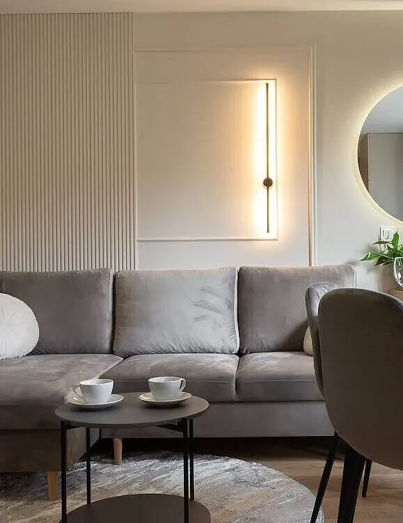
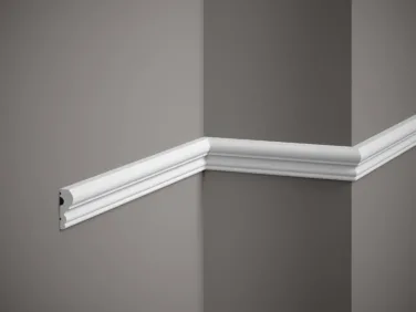
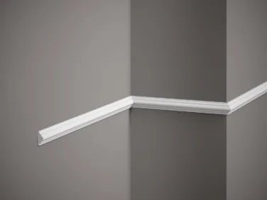
After the description, it would seem that such a monochromatic interior in colors would be boring. However, the effect shows that it is quite the opposite. Why is this? This is due to the composition and clever division of space using wall accessories. On the left side of the room there is a large wardrobe, to which wall slats are perpendicularly attached. Painting them in a colour similar to the furniture fronts makes the arrangement look coherent and light. The model used is the L0101 Mardom Decor slats. Covered with a matte primer, they allow the surface to be repainted in any colour and adapted to the specific requirements of a given arrangement. Installing the slats on the width of 1/3 of the wall allowed visually separating the storage area from the seating area. An additional advantage of using wall slats in such a small space is their positive effect on the interior acoustics and noise reduction thanks to the spatial form of the panel. A double wall frame was installed right next to the slats. The classic concept has been broken with a modern form – the frame smoothly connects with the slats on the left side, creating an open composition and giving this decoration a modern form. Additionally, a modern lamp installed inside adds style. In this way, the seating area has been clearly marked, and the coherence between the zones is ensured by a large corner sofa. The MD003 and MD325 wall strips used to create decorative screens have been matched in colour to the shade of the walls, thanks to which they are compositionally coherent, despite their expressive shape. Mardom Decor stucco is made of the proprietary high-quality PolyForce material, resistant to UV – it does not yellow over time or discolour, maintaining an excellent appearance.
QL026 curtain rod strips have been installed on the window line. They mask the unsightly curtain rod, but also introduce order to the living room, creating a minimalist, simple form on the line of the window and ceiling. Painted in the shade of the walls, they help to maintain high coherence, but also perfectly finish the arrangement, constituting the icing on the cake of the arrangement.

